
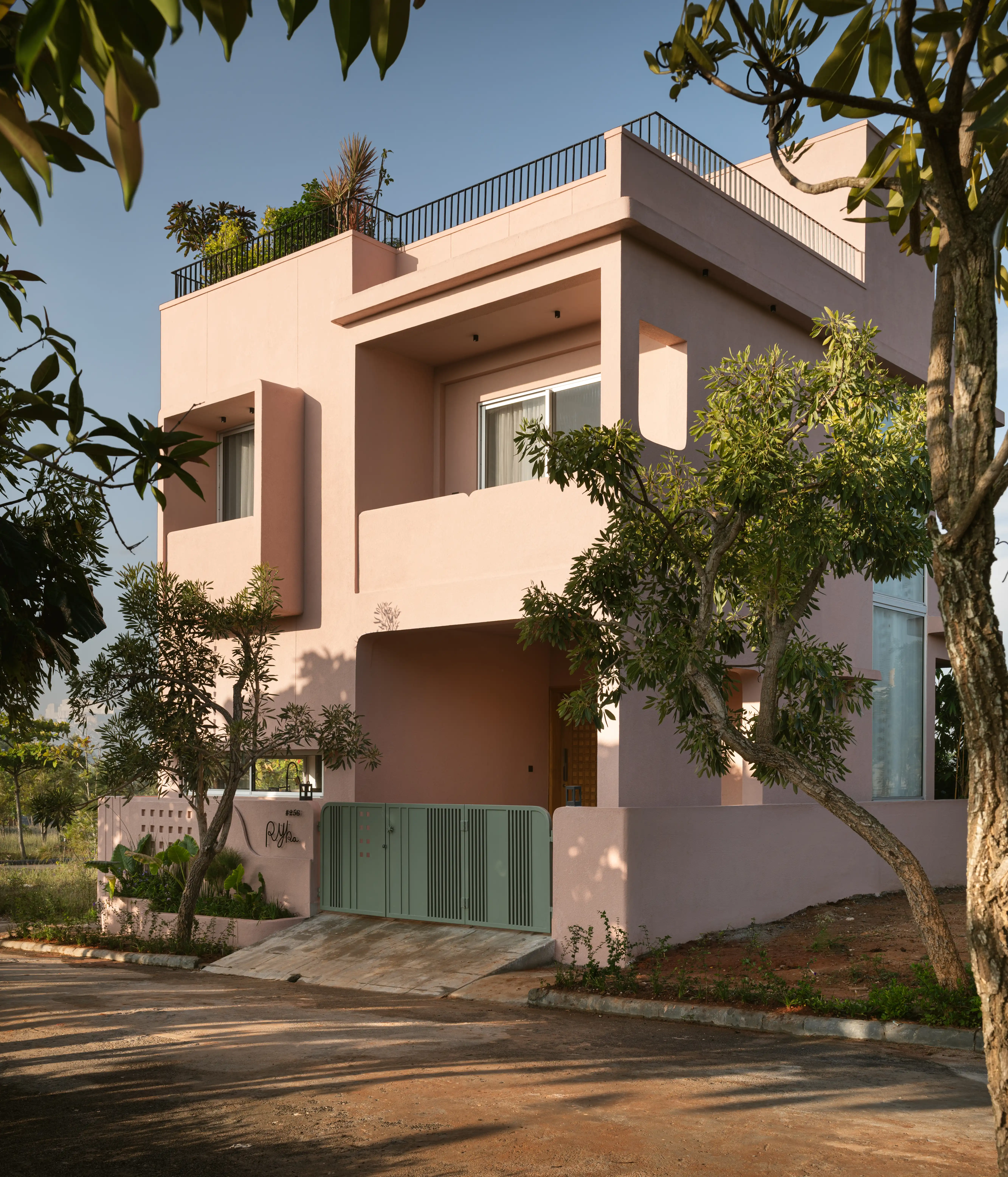
A Weekend Home by Studio Ipsa
Project Name: Ryka
Area: 2,400 sq ft (G+1+Terrace)
Location: Concorde Hillcrest, Chikkaballapur (approx. 70 km from Bangalore)
Type: Weekend Home — 3 Bedroom Villa with Garden & Terrace Deck
Interior Design Studio: Studio Ipsa (www.instagram.com/studioipsa)
Principal Designers: Sonal Mutha (www.instagram.com/sonalrmutha) and Aniketh Bafna (www.instagram.com/anikethbafna)
Photography: Nayan Soni (www.instagram.com/nayansoni21)
Project Brief:
Ryka means ‘born out of a prayer’. t is also the name of the daughter of Aniketh Bafna, founder of Studio Ipsa. And somewhere between the time a plot was bought as an investment in 2019 and the moment a home finally stood on it, the name became the only one that made sense. This home, too, was born out of a prayer.
The 30×40 east-facing plot in Concorde Hillcrest, tucked away on the outskirts of Chikkaballapur towards Andhra Pradesh, was never meant to be a home. It was purchased as a real estate investment, sitting quietly through the years of the pandemic. Then, in 2024, the calculus shifted. With so many long weekends through the year, a weekend home began to make more sense than a vacant plot. And so began Ryka.
The site is extraordinary. There is a lake to the right of the property and hills behind it. The air is different here, the pace slower. From the very beginning, the design intent was to honour that. A Japandi aesthetic — rooted in warmth, restraint, and materiality — felt like the natural vocabulary for a home meant for rest, not display. A garden in the backyard with a tree, a terrace garden, a deck, and above all, a home free of clutter. These were not mood board aspirations. They were non-negotiables.
The built-up area spans approximately 2,400 sq ft across three levels. The ground floor holds the parking, foyer, kitchen, dining, living, a covered deck, and a garden. The first floor has the master bedroom, a kids’ bedroom, and a family room, each with attached balconies and bathrooms. The terrace carries the home’s relationship with the outdoors furthest — a planted periphery, a pergola, deck seating, and a kitchenette, all framed by the hills and the lake beyond.
Exterior & Construction
The decision to self-build was deliberate. When the home is also the designer’s own, every material choice carries personal weight. The exterior is finished in a light pink texture paint — warm, tactile, and unlike anything in the immediate landscape. Against the dry terrain of Chikkaballapur, it reads almost like a blush against earth. The compound wall next to the main gate carries the name of the house: Ryka. But not in a typeset font. The letters are in the handwriting of Aniketh’s daughter, given to the nameplate vendor to replicate exactly. It is perhaps the smallest detail on the building, and among the most significant.
Parking
The parking was never going to be used for cars — the private road outside meant vehicles would stay there. Freed from its functional obligation, the space became an opportunity. Rather than defaulting to stone or plain concrete, the flooring is laid in subway tiles in a chevron pattern, in a tone that sits within the same pink palette as the exterior. The walls and ceiling continue the pink texture, wrapping the parking in the same skin as the home. A planter holds a curated collection of cactus plants — different varieties, deliberate in their placement — their structural, spiny forms set against the soft pink texture creating an arresting first contrast as you enter the gate.
Main Door
The main door was designed to be a statement — the moment of transition from outside to inside, and it needed to earn that. The vaskal (frame) is crafted in American White Ash with a layered step detail, chosen to complement and frame the door rather than merely border it. The door surface is covered with a grid of individual American White Ash squares — a pattern that is bold in presence yet precise in execution. The decision to use this level of relief came from a desire to introduce clean, geometric detail into the home from the very first touch point, while remaining fully aligned with the Japandi language of craft and restraint. A long brass handle is fixed to the door, adding a vertical counterpoint to the horizontal rhythm of the squares.
Bedroom & Bathroom Doors
The doors throughout the home — all bedroom and bathroom doors — follow a design language that is consistent yet quietly crafted. Each door begins with a flush door base, onto which a layer of oak veneer is fixed. A second layer of oak veneer, CNC cut to remove 1-inch by 1-inch squares in a precise grid, is then fixed over the first. The result is a door with depth and shadow — the cut squares creating a woven relief that catches light differently through the day. There is no applied hardware, no decoration, no distraction. Just the geometry of the pattern and the warmth of the oak grain beneath. Against the texture paint walls of the home, these doors read as considered architectural elements rather than functional partitions — and they make everything around them feel more resolved. The American White Ash frames that border each door complete the composition, consistent with the main entrance and tying the language of the home together from first entry to last room.
Foyer
The foyer sets the interior palette immediately and without ambiguity. The walls throughout the home — beginning here — are finished in a texture paint with a lime plaster-like quality: warm, matte, and slightly imperfect in the best sense. It gives every surface a depth that flat paint cannot achieve and ensures the architecture itself feels crafted rather than just constructed.
The first thing that greets you is the console — bespoke, sculptural, and made entirely in grey travertine. The stone was chosen not just for its aesthetic resonance with the Japandi palette but for its inherent character: the natural pits, veining, and grain of travertine give the piece a presence that polished stone could never achieve. The console’s form is deliberately sculptural — its legs curved and organic, acting as an art object as much as a functional surface. Above it hangs a large custom painting by Old Wall Factory: deep, layered, and brooding in the best way.
The choice to go abstract and tonal here was intentional — the home needed a moment of visual depth early, something that rewarded a second look. The styling across the entire home was kept deliberately minimal and clutter-free. Not as a design trend, but as a philosophy. This is a home for rest. Every surface breathes.
Staircase
The staircase was always going to be more than a means of moving between floors. From the ground floor all the way to the terrace, a fixed glass panel runs the full height of the home, flooding the stairwell with natural light and, from the outside, creating one of the most defining features of the elevation. The blush pink of the home’s exterior becomes visible through the glass at night, and during the day the light that pours in transforms the stairwell into the brightest, most alive space in the building.
The treads and risers are finished in Neo cement in a pink tone that matches the exterior of the home — the same colour, but in the finer, smoother texture of the interior finish. The decision to carry the exterior colour inside on the staircase was deliberate: it makes the stairs stand out against the warm grey-greige of the interior walls, creating a moment of surprise and visual continuity simultaneously. Looking up the staircase from the ground floor, the pink treads rise against the textured walls like a thread connecting all three levels.
The railing is a composition of black metal vertical balusters with a solid wood handrail that curves continuously at every landing junction, never breaking, never stopping. The fluidity of the handrail against the precision of the balusters captures the same tension that runs through the rest of the home — organic softness and geometric clarity, side by side.
At the double-height window, two panels of custom sheer curtains hang in front of the fixed glass. The fabric was chosen after Moire suggested the pattern, understanding the character of the home. It carries a block-printed pattern of circular dots and stripe motifs in a warm golden tone — each panel printed as a mirror of the other, so when they hang together the pattern creates a composed symmetry. Filtered through this fabric, the light that enters the stairwell is golden, warm, and entirely in keeping with the home’s spirit.
Living, Dining & Kitchen
One of the most consequential decisions in the ground floor layout was merging the kitchen and dining into a single zone, with generous breathing space between it and the living room. What could have been three fragmented rooms became two distinct but deeply connected worlds. The decision opened up the floor plan in a way no amount of furniture arrangement could have achieved.
The flooring throughout the ground floor — and the home — is a 2×4 ft cement-look tile in grey with a mild texture. It is a canvas more than a statement: consistent, grounded, and generous enough to let everything above it do the talking.
The ceiling above the kitchen, dining, and living is one of the home’s most distinctive architectural gestures. A structural constraint — the sunken slab of the bathrooms above dropping 18 inches — was turned into an opportunity. Rather than masking the transition with a flat false ceiling, organic hill-shaped bands were introduced, running continuously from the living room through to the kitchen. The ceiling drops 18 inches in the living and dining zones and just 6 inches in the kitchen, and the transition between the two is handled through these flowing, curved forms. The reference is not accidental: the hills visible behind the property find their echo overhead, bringing the landscape inside in the most subtle of ways. The same warm texture paint used on the walls covers the ceiling, unifying every surface in the same material voice.
Kitchen
The kitchen faces east onto the private road, and the decision was made early: no dado tiles, no backsplash. Instead, a full-width horizontal window runs between the base and overhead cabinets, framing the greenery outside like a living painting. During the monsoons especially, this window transforms the act of cooking — flooding the kitchen with natural light and connecting the interior to the landscape in a way that no tile, however beautiful, could.
The base cabinets are finished in white oak veneer — warm, tactile, consistent with the material language of the home. The overhead cabinets, in contrast, are done in a laminate that matches the tone of the texture paint on the walls exactly. The intent was for them to recede and disappear into the wall so that the window becomes the undisputed hero of the kitchen elevation. The countertop is white quartz — a choice that reappears on the dining table and coffee table, creating a thread of material continuity across the entire ground floor. Since this is a weekend home, the loft was omitted entirely: storage needs are minimal, and the cleaner ceiling line was worth more.
Dining
The dining is anchored by a bespoke L-shaped banquette, its backrest formed by the slightly elevated chopping counter of the kitchen — a detail that is both functionally clever and spatially elegant. The banquette’s backrest edge curves softly at the top, a deliberate departure from the straight-backed bench that would have felt too rigid for a home meant for ease. The upholstery fabric is from Moire. Paired with the banquette are two dining chairs, both custom made by Studio Ipsa’s in-house furniture maker in the same material language. The dining table has three solid wood cylindrical legs and a white quartz top — the same quartz as the kitchen counter, reinforcing continuity. The table is sized for four to five: enough for a family weekend, no excess.
On the wall above the banquette hang a set of ceramic discs sourced from an artist in Greece — discovered online, brought in because their texture felt right. Against the warm texture paint, they read as quiet art: tonal, tactile, and entirely in keeping with a home that chooses restraint over noise.
Living Room
The living room is generous in its simplicity. An L-shaped sofa — gently curved, not aggressively so — anchors the space along with two armchairs and a round coffee table, all custom made. The coffee table top is the same white quartz that runs through the kitchen counter and dining table: a quiet but deliberate thread. The floor is dressed with a rug from Jaipur Rugs, its organic pattern adding warmth and delineating the seating zone without hard edges.
The wall behind the sofa is intentionally bare. No art, no panelling, no feature wall. The texture paint was always meant to be the surface, and here it is allowed to be exactly that. Tucked beside the staircase, a built-in window bench faces the garden — the kind of spot a home earns rather than designs: for morning coffee, for a book, for watching the light shift through the trees outside.
Common Bathroom
The common bathroom on the ground floor is compact but considered. The shower area is tiled in full-height wooden-finish tiles — warm, grain-textured, and deeply aligned with the material palette of the home. Against this, the dry area walls are finished in Neo cement, its smooth matte surface offering a textural counterpoint to the tactile warmth of the wooden tiles. The flooring continues in the same grey cement-look tile used throughout the home.
The vanity unit is the room’s standout moment. A bespoke concrete wash basin by Cretkala in a deep, rich blue sits atop a custom vanity cabinet whose shutters are CNC cut in HDHMR and finished in PU matt — the grid pattern precise and graphic, finished with brass knobs. In an otherwise neutral bathroom, the deep blue basin is a deliberate and confident pop of colour. Fixtures are in brushed brass throughout, and an oval organic mirror sits above. The bathroom door introduces the jali-pattern consistent across all bedroom and bathroom doors in the home.
Covered Deck & Garden
The living room opens directly onto the covered deck, and it is here that the home reveals perhaps its most personal moment. From the very beginning — even before construction started — there was a vision: a garden with a tree. Not a landscaped, curated garden, but a real one. The kind with a tree you sit under. And that is exactly what was built.
The deck holds a bespoke bar unit, positioned so that its legs — installed at 45 degrees — face the foyer directly. As you enter the home, before you’ve fully taken in the space, you catch that detail. It was designed to be discovered, not announced. The carcass and shutters of the bar unit are finished in Neo cement on plywood — chosen for its impermeability to the outdoors — in a warm grey-greige tone. One shutter carries 11 half-spheres in American White Ash solid wood arranged in a single vertical column, with full spheres used as handles. The form is simultaneously functional and sculptural.
The deck flooring continues the same grey cement-look tiles from inside, dissolving the boundary between indoors and out. From the deck, the garden unfolds. A built-in bench in civil construction with a black granite top sits at its edge. Circular stepping stones are laid into the grass, leading you deeper into the garden. The planting is layered and lush, the boundary wall in the same blush pink as the home. The tree — the one that was always part of the dream — stands at the heart of it. At sunset, the light catches the pink walls, the green canopy, and the hills beyond.
First Floor
Staircase Landing & Transition
Ascending the pink Neo cement staircase, the first floor opens into a quiet transition zone that connects the three rooms. The material continuity of texture paint on walls and ceiling carries through unchanged — the same warm, matte surface that defines every space in the home. The doors to each room announce themselves here: oak veneer with the CNC cut woven grid relief, framed in American Ash, consistent and considered.
Master Bedroom
The master bedroom was conceived around a single idea: seamlessness. The bed, the headboard, the bedside extensions — all finished in Neo cement, all in the same tone as the walls — but each a different form. The result is a room that feels like it was carved from a single material rather than assembled from parts. There is no traditional headboard. Instead, an organic wave relief is sculpted directly into the wall above the bed — a flowing, continuous line that moves from one side to the other, giving the bed its backdrop without interrupting the surface. It is the most understated gesture in the room and the one that makes the most impact.
The mattress sits on a raised Neo cement base, giving it weight and grounding without the need for a bed frame. On either side, fixed bedside extensions in Neo cement each have a drawer at the bottom and an organic-shaped piece of veneer placed on top — warm, tactile, reading like a natural cross-section of wood set there. Above each, a tiered natural fibre pendant light hangs from a single black cord — its layered fringe rings casting a warm, diffused glow that makes the corner of the bed feel like the most comfortable place in the home.
The false ceiling curves softly toward the walls rather than meeting them at a hard edge — a cove-like transition that makes the room feel enveloped rather than boxed. The same texture paint runs continuously from wall to ceiling, reinforcing the sense of being inside something whole.
Opposite the bed, the wardrobe wall is fully clad in white oak veneer — warm, grained, and rich without being heavy. The shutter panels are inset with a fabric woven wallpaper, its texture adding tactility and breaking the uniformity of the wood grain without introducing colour. Concealed solid wood handles maintain the clean lines. At one end of the wardrobe, open shelves provide display space for books and objects. A full-length mirror on the wall beside it completes a dedicated dressing corner that feels personal and unhurried.
The flooring continues the 2×4 ft grey cement-look tile used throughout the home. The curtains are in a warm linen tone, layered with a sheer that filters the light from the balcony. The entire room is designed to feel like a holiday — not a hotel, but the kind of place you forget what day it is.
Master Bathroom
The master bathroom was designed to feel like a resort. The ambition was simple: step in and feel far from the city.
The floor is laid in broken dolomite — irregular pieces of stone with white grout running between them like the mortar of an old courtyard. It is tactile underfoot, alive with variation, and unlike any tile floor. The walls are clad in stone-finish subway tiles — raw, textured, earthy — running full height through the shower and across the wet zone. The combination of the broken stone floor and the rough-surfaced wall tiles creates a bathroom that feels like it belongs to the landscape outside rather than a building. All fixtures are in brushed nickel, understated and functional. A built-in niche in the shower provides storage without breaking the surface. An artwork of birds in flight hangs above the WC — light, quiet, and at home in a room that already feels close to the outdoors.
Kids’ Bedroom
Ryka’s room was designed with the same care as every other space in the home — not simplified because it is a child’s room, but considered differently. The walls and ceiling are finished in a light pink texture paint, a shade softer than the exterior, warm and enveloping. The flooring is the same grey cement-look tile used throughout the home, consistent and grounding. The bunk bed is custom made — a solid wood frame with a pink metal ladder and railing, its ball-tipped posts a small gesture of playfulness within an otherwise restrained room. The choice of pink for the metal — not a primary pink, but a muted, dusty tone — keeps the room from feeling themed while still speaking directly to a child. By flushing the bunk bed against one wall and the wardrobe against another, the room achieves something more important than good looks: floor space. For a child, floor space is everything — for play, for activities, for just being. The layout was planned with that in mind from the beginning.
The wardrobe is in white oak veneer, its shutters featuring vertical solid wood semi-sphere beading — a detail that adds rhythm and texture without weight. It is consistent with the material language of the home while carrying a slightly lighter, more playful touch appropriate to the room.
One corner of the room is given entirely to the view. An L-shaped bay window was deliberately planned here to frame the hill behind the property and the sunset beyond it. This is not a standard window — it was positioned and sized to give a child the best seat in the house for watching the day end. The bay window seat is upholstered and cushioned, flanked by the curved open shelving unit that holds toys, books, and small treasures at a child’s reach. A roman blind in a delicate botanical print sits within the window, with a sheer curtain layered in front. The blind gives privacy and light control; the sheer diffuses the light that comes through into something softer and dreamier, making the window nook feel like a little world of its own.
A full-length arched mirror in a solid wood frame leans against the wall beside the wardrobe — practical, but also the kind of thing a child will grow into. The room is designed to evolve with Ryka rather than need replacing.
Kids’ Bedroom
The kids’ bathroom is warm and considered. The shower zone is tiled in a sunshine buttercup yellow stone-look tile — 4×4 inches, with a natural texture that gives the wet area warmth and character. The dry area walls are finished in Neo cement in a cool grey, offering a clean contrast to the yellow tiles and keeping the space from feeling heavy. The flooring is the same grey cement-look tile as the rest of the home.
The vanity features a sculptural fluted marble wash basin — white, organic in form, with a rippled edge that adds tactility to an otherwise simple counter. A piece of artwork hangs above — a framed print of a girl reading, unhurried and absorbed — the perfect image for a child’s bathroom. Simple, personal, and quietly aspirational.
Family Room / TV Room
The family room sits above the parking, facing east, and the morning light that comes through the balcony and sheer curtains gives this room a warmth that makes it impossible not to linger. The walls and ceiling are finished in the same texture paint as the rest of the home, with the ceiling curving softly at the edges where it meets the walls — a cove transition that makes the room feel held rather than cornered.
The sofa cum bed is upholstered in a soft, warm-toned fabric — generous, low, and inviting. Two armchairs in boucle fabric with solid wood frames sit opposite, their tactile upholstery adding another layer of texture to a room that is already rich in surface. The coffee table is the room’s most deliberate contrast: a raw, organic black stone form — sculpted, heavy, irregular — that anchors the seating arrangement and stands in sharp relief against the muted palette around it. It is the one moment in this room where the design raises its voice, and it does so with complete confidence.
On the wall opposite the balcony, a double-arched alcove frames the television and the floating oak veneer unit below it. Open shelves within the arch hold books and objects, their warm wood tone consistent with the material language throughout. The arch itself — with its layered moulded edge — turns what could have been a plain TV wall into an architectural moment.
The wall art above the sofa is the room’s most personal detail. It is a fingerprint — Ryka’s fingerprint, enlarged, rendered in textured plaster on canvas by Old Wall Factory. Aniketh pressed his daughter’s finger to paper, scanned it, and sent it to the artist. What came back is a large-scale work in warm off-white tones that reads as abstract art until you know what it is — and then it becomes something else entirely. Her name is on the gate. Her fingerprint is on the wall. This home is marked by her in every sense.
A tall Dracaena plant in a woven basket pot stands in the corner, its sharp graphic leaves adding a burst of green against the texture paint. In a room this considered in its tones, a living plant does more than any artwork could. This room is, without question, the most Japandi space in the home.
Terrace
The terrace is where the home fully opens itself to the landscape that inspired it. From here, you can see the lake to the right of the property and the hills behind it. At sunset, with the sky changing colour over the water and the hills going dark, it is exactly the kind of view that justifies every decision made below.
The terrace is divided into two halves. The front half is open — clear sky, open air, the full panorama. The back half is covered by a pergola, creating a sheltered outdoor room that can be used in any weather. String lights and warm pendant lighting woven through the pergola structure make this space as inviting at night as it is during the day — the kind of lighting that turns a terrace into a destination.
Along the periphery, a continuous civil planter holds a collection of plants — greenery running the entire edge of the terrace, creating a sense of being surrounded by nature rather than exposed on a rooftop. The waterproofing, slope, and drainage were all carefully engineered to support this planting without compromise.
Under the pergola, built-in seating is constructed in civil work with a black granite top — its base inclining inward at the bottom, a detail that lifts the bench visually and prevents it from feeling heavy. Two armchairs and an end table complete the seating arrangement. A small kitchenette is tucked within the covered zone — functional, compact, and perfectly placed for a sundowner. Cold drink in hand, the lake catching the last of the light, the hills darkening behind it. This is why the home was built.
Closing
Ryka is not a showcase. It is not a project that announces itself. It is a home that was built with complete personal conviction — every material, every detail, every spatial decision made by someone who knew exactly what he wanted and why. The pink exterior, the travertine console, the fingerprint on the wall, the daughter’s handwriting on the gate — none of these are design gestures. They are the home’s autobiography.
What Studio Ipsa brought to this project was the discipline to ensure that the personal never became indulgent, and the craft to ensure that the restrained never became cold. The result is a home that feels entirely of its place — of the hills behind it, the lake beside it, and the family within it. A home born out of a prayer. And built to last.