
Project Type : 3BHK
Project Area : 5000 sq. ft.
Project Location : Bangalore
Brief:
This beautiful Bangalore home is a 5 bedroom villa which roots in vernacular architecture and simple interiors that is timeless yet making perfect sense in the contemporary context.
Spread over 6850 sqft, divided into 4 levels, this home has its aesthetics anchored in the presence of brick and wood as the main elements of design making this home eco-conscious and nostalgic. It speaks a story of this family where two brothers with each of their families live together in comforting rootedness in an evocative environment.
It showcases their simplistic lifestyle, their culture and nature and their need for keeping everything uncomplicated and relaxed, thus moulding this home into a compelling narrative.
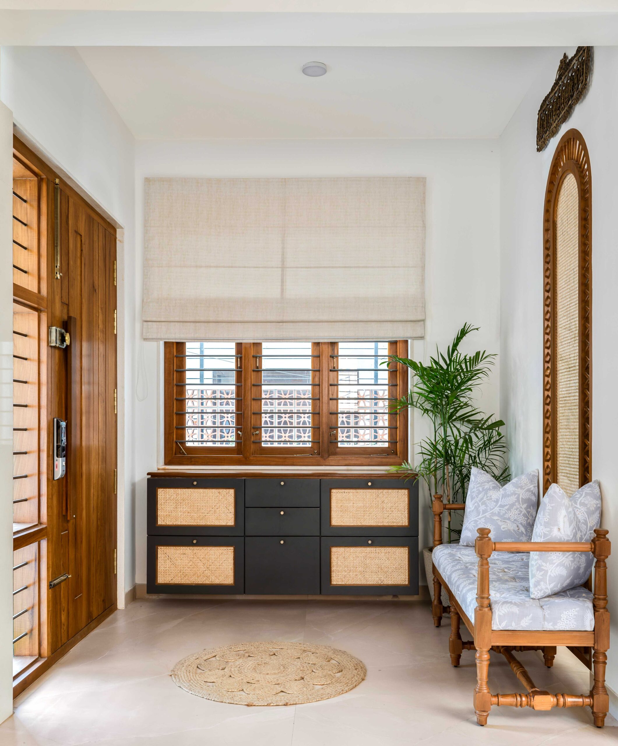
As one walks through the main door, they are led into a foyer space that reflects the tonality and materiality of the rest of the home perfectly. We masked a structural column by creating a wall with a niche, where we conceptualised a statement arch wood feature made in combination with rattan. This not only provided privacy to the family seating behind, but also provided a peek through because of its design, from the family space to the main door. We custom made a wood carved bench in a traditional design language and completed it with tufted, upholstered cushion wrapped in a delicate chinoiserie fabric. Behind the door we tucked in a sleek pull down cabinet for shoes, which is finished in a charcoal grey and closed weave rattan, complimenting the wood gorgeously.
Walking further into the home, a double height living space shows up which has a pass through window looking into the kitchen on one side and the staircase on the other. It is wrapped with brick wall on two sides and we decided to retain this aesthetic in its true glory by not bringing in any other material to juxtapose these walls. The living has a simple demeanour working functionally with a couch and armchair set up and a clean lined media cabinet. With wood and brick bringing in the earth tones into the space, we wanted to add a lovely colour pop of blush into the upholstery to make the space come alive. An intricately wood carved centre table and transitional rug bring this space together in perfection.
At the double height where we witness a transition from an exposed brick wall to a neatly plastered section, we customised exotic wood carved panels to adorn the wall. We kept the finish of the panels closer to the wall colour, to avoid it from being overwhelming. However what really makes a bold statement is the way we conceptualised the ceiling. We decided to do a teak wood coffered ceiling but brought in a glimpse of the rich South Indian culture by carving out the wood in patterns simulating the quintessential Rangoli and furthered this idea by using coloured panels as the base layer of the carving, to show the beautiful use of colours that women usually incorporate in their rangoli designs. We added a final touch to the magic of this space with large sized pendant lights wrapped in fabric, illuminating the living in a glow that is warm and soothing.
Behind the primary living set up is the smaller secondary living for which we worked out a seating arrangement that comprised of a wood and cane couch and a pouffe seat. Finishing it up with the same wood carved centre table and a distressed rug, we made the space feel inviting. In this zone, also sat the Pooja room. Considering the requirements of the pious inmates and aligning the design with the rest of the home, we customised a teak carved door frame depicting religious iconography. For the sanctum of this pooja room, we cladded the wall using a backlit marble with rich jaali details. We also provisioned cove lights to enhance the vibe of this space, embracing the room in a soft glow.
The layout of this home facilitated a private dining space accommodating a modest 6 seater teak dining set up. Extremely pared back and functional, the dining room is adorned with exposed brick walls on one end and beautiful botanicals on the other.
We brought in a linear light fixture made in concrete to add a final touch to the vibe we intended to create.
Opposite to the dining space, we had the kitchen which was also overlooking into the living. With a full view at our disposal, we decided to maintain the kitchen in the same colour scheme as the other public spaces. An organic decision was to do a timeless kitchen using a classic combination of wood and whites. The base cabinets were done in teak veneer with fine trim details at the edge, while we chose white for the upper cabinetry to avoid the kitchen from looking heavy. The most interesting addition here was the introduction of tones of grey in the backsplash tiles that were selected. A subway tile was chosen with a glossy finish and we laid this out in chevron pattens bringing in elegance into the kitchen.
At the pass through window side we designated the space as a preparation counter and dded a low back stool. The appliances were fitted to the other side in a corner, making the kitchen work best ergonomically and aesthetically.
We conceptualised the powder bath of this floor to exude a classic richness. And in order to do so, we chose tiles in the most gorgeous navy blue tones, juxtaposing it with cool greys. A moroccan patterned highlighter dresses the vanity wall and the ledge wall at the rear end. We also got in patterns on the floor by using a combination of blue and grey tiles. To balance the use of patterns, we chose to do minimal grey tiles for the rest of the walls. What really leaves a mark is the monolith wash basin made in black quartz complimenting the blue perfectly. We also introduced an antique brass finish in the sanitary ware and lighting, going all out by considering even bottle trap accessories in antique brass and this worked as accents in this space – which heightened the look several notches higher.
As we walk up to the next level, the floor opens up to another family space before we reach the rooms. The space has a very simple couch and media unit set up. We custom made the media console in solid wood and glass with slider shutters for easy access and spindles on the ends add to the design. What really steals the show here is the bay window design. It is an immersive space that reflects vernacular wood craftsmanship. We panelled the seat and the walls with pressed wood pieces and designed very detailed corner pillars at the outer frame. Apart from these pillars what really encloses the bay window into a cozy sitout is the addition of the top trim that we CNC cut to feel like a laced border to this set up. A composition just perfect for a coffee by the window or maybe a good read.
The first bedroom is the elder brother’s room and is a beautiful montage of colours, patterns and rich teak. A patterned wallpaper acts as a fabulous backdrop to a teak bed we tailor made for this room. We designed the headboard posters with spiral cut details and used the frame to enclose the cushioned headboard that we upholstered in the most calming sage green tone. Accompanying the bed is a cute compact bedside table with drawers made with wooden flutes, styled with a beautiful cane table lamp.
An armchair and ottoman sit at the leg end of the bed and we upholstered this in a beautiful suede blush fabric, bringing in the contrast to the headboard green but working well in the scheme of the room. A closet runs along another wall which was made in fluted teak as well emulating a shaker style design however with our touch of rounded edges. A vintage arched brass mirror stands tall beside serving its function. The room also has a simple corner study situation, that runs along into a media cabinet.
The second bedroom is the younger brother’s room which is rooted in the timeless wood and white aesthetic. We layered the headboard wall with a teak panel as the base, which we custom detailed in chevron pattern in an eclectic approach.
Ahead of this panel runs a rail, on which we hung the cushioned headboard. We chose a striped indigo fabric to further the interplay of geometrics in this zone. The compact bedside tables too have a clean cut panel detail, adding to the clean lined aesthetic.
In front of the bed sits a media console with conical flute details and legs fabricated in metal. We topped this cabinet with quartz for easy maintenance. The closet runs along the left wall and we designed the shutters in white to avoid an overwhelming dose of wood in this smaller room. We however weaved in teak in highlight elements like the diamond panel running across the shutter and the open boxes at the dresser.
As we move higher to the next level, we reach the another breakout zone which is an open court. Massive arch windows inset into exposed brick walls frame this court. The space has a double height skylit zone at one end that adds gorgeously to the already brightly lit court. Apart from the structural statement windows, the flooring piques the attention with its contrasting bands and borders and inlays. We laid out a band of simple grey and white veined tiles as the outer layer to really showcase the inner rustic tile with cute coloured inserts that had vintage ethnic patterns embossed on them. An offset mosaic border also cut through the grey tiles to add another layer of intricate detail. Within this bordered setup, we had our seating arranged that comprised of a solid wood swing and an eclectic wooden armchair. The swing was detailed with intricate patterns on the back rest and the pillar heads illustrating the varied wood working styles. At the ends of the court, we created a separated planter section for the tall beauties, bringing in the greens which add life to the whole set up.
The third level also has a large open study. The clients who usually worked from home and worked together, required a large space for their home office. We utilised the ‘L’ wall of this space for study desks for 3 people. A simple ledge above the table for storage and a large peg board display at the ‘L’ corner complete the study area. At the other corner, we conceptualised a full height bookshelf cum curio showcase, detailed with arches and flutes. We custom designed a winged chesterfield and an ottoman for this area serving comfortably in this reading nook. The massiveness of the structure and the chunky chair make a statement that looks nothing but luxurious.
The third bedroom is the daughter’s room and after a discussion with the client we moodboarded the aesthetic of this room to exude a chic vibe. We however kept the details minimal to result in the design looking neat and clean lined. We designed a teak bed with a spindled headboard and upholstered cushions with tie backs hang onto these spindles. We textured the backdrop wall in greige tones and it compliments the bed perfectly. We chose the subtlest of blush tones for the closet and highlighted the design with rattan and minimal black handles. A rattan bordered mirror accompanies this set up while the other side of the room houses a small study and a running media ledge. The design entails soft curves throughout, marking the accents of the room.
The fourth bedroom was going to be used as the guest bedroom and hence we played with classic wood tones in combination with whites. A thick teak panel runs along the headboard wall and we detailed this in a customised flutes and slats design. We chose a nude suede fabric for the headboard and it sits neatly in panels on the teak, bringing out a contrast that exudes elegance. One side of the bed has a nightstand and the other runs into a deep ledge that could also be used as the study. Neat white and wood wardrobe lines the other wall with a tucked in dresser space making the best use of the available space.
The next floor above houses a kitchenette (because this is a large home and for days when parties or get togethers are held on the terrace – it just made perfect sense to have a second space additional to the kitchen on the ground level, a room belonging to the son and his spouse and a small terrace. The kitchenette is strictly functional and we kept the design minimal and maintenance friendly. Taupe cabinets and a black countertop work up a contrasting theme and we used hexagonal tiles for the backsplash in a random laying pattern. An old rose tone is used to paint the rest of the wall and the entire set up works interestingly together to look unconventional yet beautiful.
The fifth bedroom has a fresh vibe with its colour palette that involves fresh green tones in accent. The bedroom has a beam cutting through its width and instead of masking it, we leveraged it to visually zone the room out into two spaces. We used wooden flutes on the ceiling above the bed area and drooped this panel down to the wall behind the study, making the space look cozy and comfortable. On the headboard wall we opted for a half and half wall treatment with the lower half detailed in green grooved panels and the upper half in grey textured paint. A chevron panelled headboard sits atop the green providing cushiony comfort at the bed. The interplay of patterns works so well and exudes just the right vibe for the young couple occupying this room. The other side of the room has a media console and an armchair – floor lamp setup works in the corner as a reading nook. Behind the TV wall lies the walk-in closet, designed in minimal aesthetics, keeping functionality at the fore.
Though the entire home has varied design details for every space that are an embodiment of the personalities using them, there is a common thread running through the designs with the significant presence of teak that ties together the home cohesively in its design language.


Write a comment